Quantitative risk-based comparison of options
Introduction
This case study summarises a quantitative range analysis of the possible costs associated with each of two options for the procurement of an Asset Management and Maintenance System. The client who was considering the system acquisition operated an asset-based utility business.
This was not as straightforward as the usual analyses we conduct to support this kind of decision:
- Due to the complexity of the requirement and its intimate interaction with business operations, the team was committed to an agile development approach, fixing the total cost and delivering as much scope as possible within that agreed budget
- The team wanted to package the risks in a particular way, using a ‘parent risk’ concept (similar in many ways to the ‘headline risk’ approach we often use to simplify a long list of specific risks), which reflected both the way that funding was being managed and the contractual arrangement foreshadowed in the procurement documentation.
The case demonstrates a straightforward quantitative approach to comparing options. It generated far more insight than could be obtained from a simple comparison of the initial quotes from software vendors and the analysis stimulated intense discussion among senior project team members that resolved several misunderstandings and helped to develop a level of shared understanding that had not existed prior to the analysis.
A funding allocation had been agreed for the project prior to the engagement of the project director who commissioned the risk analysis.
Quantitative assessment
Assessment workshop
The starting point for the assessment was the price expectation derived from vendor information, which consisted of license charges and implementation effort, planned as a series of sprints. Initially, Vendor A seemed far cheaper than Vendor B.
The major sources of cost uncertainty relating to these costs were judged to be:
- Gaps in off-the-shelf functionality that would need to be filled to meet the needs of the business
- Configuration requirements that could not be specified entirely prior to detailed investigation, exposing the project to the risk that they might not be delivered within the planned sprints
- Poor integration with existing systems and legacy data that would require additional effort and possibly additional licenses for third party software to meet the needs of the business
- A requirement for additional licenses due to sizing and the way license terms might be interpreted for an installation in the organisation.
Each of these costs was assessed in a structured workshop process, considering the two vendors side by side and assessing what savings or additional costs could arise if each option was to be pursued. The additional cost and effort was described in terms of an optimistic, a likely and a pessimistic outcome. The optimistic and pessimistic values were taken to be nominal P10 and P90 values of the possible range of outcomes, that is values that have a 10% and a 90% chance of being sufficient to cover costs associated with that risk.
The assessment of the costs of each of the four parent risks was recorded in data tables in a template like Table 1.
Table 1: Data table template
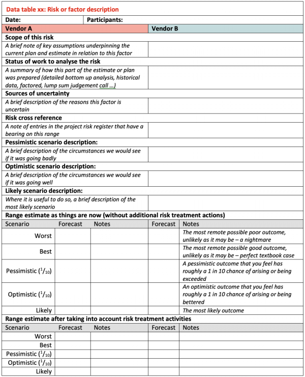
Context information was gathered first, describing the sources of uncertainty and two scenarios that could arise, one pessimistic and one optimistic. The range of values that could arise was then described using the five points shown in Figure 1 in the order shown below the X-axis.
Figure 1: Assessing variation in an uncertain quantity
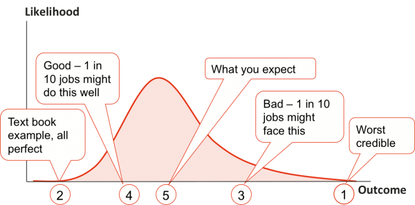
Values were assessed working from the outside of the possible range inwards and from pessimistic to optimistic. The extreme values are uncomfortable to contemplate but they are a key part of the process. Assessing them helps to break the anchoring effect that will otherwise see unrealistically narrow ranges proposed. However, as they are very unlikely to arise, they do not provide useful modelling data. This approach is discussed in more detail in a Broadleaf resource paper here.
The pessimistic and optimistic values, nominally the P10 and P90 values, are closer to the experience of the participants and provide useful modelling data. Along with the most likely value, they are used in a quantitative model to define a distribution representing the cost. The most likely outcome is the value with the highest chance of happening, the peak of the distribution representing a cost in the model.
Quantitative data were sought in forms that were easiest to assess.
- Additional effort was described in terms of sprints where one sprint was assigned a cost based on the relevant vendor’s rate card and the terms set out in the RFT
- Additional costs were described directly in dollars or, for vendor licenses, in terms of a percentage uplift on the initial value advised by the vendor. For this analysis, the data table was split into two with Vendor A on the left and Vendor B on the right. This ensured that both vendors were assessed on the same terms, which was important both for the integrity of the process and for probity reasons.
The quantitative table at the bottom was replicated so that the range could be described before any further risk treatment activity, as perceived by the team at the time of the analysis, and then with further risk treatment in place. The details of the planned treatment actions were documented elsewhere and used as a reference in the workshop but were not replicated in the risk assessment templates. Some treatment actions, such as data cleansing and work on data base record structures, were developed to address issues that would be the same regardless of which vendor were selected.
Workshop participants
Participants in the quantitative assessment workshop included the project manager and the key managers in charge of operations, asset management, maintenance, project delivery and information technology. Additional technical specialists provided expertise on procurement, legal and implementation matters.
Prior to the workshops, some participants had formed a view of which tender they preferred. Their fixed position was teased out in the workshop and challenged by other participants, ultimately resulting in an agreed position.
Quantitative modelling
The optimistic, likely and pessimistic values were used to define one distribution for each risk area in an Excel model using the @Risk add in. The cost distributions were added in the model to calculate the total cost of the risks and, in turn, these were added to the base costs from the initial vendor information.
The distributions for the four parent risks were correlated to reflect the expectation that the work would probably proceed smoothly on all fronts or face challenges on all fronts, mainly subject to the vendor’s attitude to co-operation with the utility business. The analysis at this stage did not incorporate the cost of the treatment actions directly but they are obviously a fixed additional cost for the post-treatment forecast.
Quantitative outcomes
The initial results of the analysis are summarised in Figure 2, with the cost distributions in density form. This shows that Vendor B is very much more expensive than Vendor A, and even Vendor A could exceed the predefined funding limit without additional risk treatment. There was no chance the Vendor B option could be delivered at the initial quoted price and it was certain to incur costs far in excess of the quotation.
Figure 2: Cost distributions including risk, before treatment
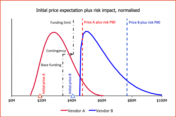
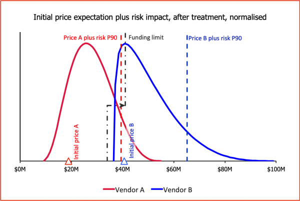
Figure 3 shows the cost distributions with the ranges that are expected with additional risk treatment in place. As noted earlier, the costs of implementing the treatment actions is not included here; they would be additional costs that would move the distributions to the right, noting that the treatments being considered were based on the organisation rather than the vendor and so would be the same for both vendors. The chance of delivering the Vendor A option within the funding limit is now over 90%.
Figure 3: Cost distributions including risk, after treatment
Following the analysis, Vendor A was selected as the preferred option.
Lessons
Eliciting range information
We use templates like the one in Table 1, and the sequence of estimates in Figure 1, routinely when we conduct workshops to elicit range information for a quantitative analysis. The structure helps to minimise the well-established biases of over-confidence and anchoring as far as possible, while maintaining a detailed record that allows estimates to be updated as new information becomes available. The template shown here also provides a narrative description of each source of uncertainty that senior managers can read to understand the nature of the risks that a project faces. It is a valuable asset for communication as well as a record of the analysis.
Here we extended the template to analyse two vendor options side-by-side. This enabled the team to compare procurement and implementation assumptions more easily, identify key points of difference between the options, and ensure a like-for-like comparison. Having the detail to hand also assisted in developing viable risk treatment options.
Comparing options when there is uncertainty
The initial quoted price from Vendor B was substantially more than that from Vendor A. Our client wanted to know whether Vendor A was really so much cheaper, after taking account of the obvious risks associated with an information system implementation and the uncertainty associated with an agile delivery method, an approach with which the team was not fully familiar. Vendor A was the incumbent in some parts of the client’s business and there was a suspicion that they might have deliberately underbid the project with a view to escalating the price later.
Diagrams like Figure 2 and Figure 3 allowed a more reasoned justification to be developed for selecting Vendor A than a simple quoted price comparison, while dampening some of the optimistic expectations raised by the initial prices.
- It was clear that there is very little overlap between the distributions, so Vendor A would be preferable to Vendor B in almost all circumstances
- It was also clear that the initial quotes were very optimistic, and that choosing Vendor A would cost considerably more than the initial cost by itself might indicate, but this could be allowed for with relevant information
- Comparing the cost profiles with and without risk treatment provided a justification for implementing further risk treatment measures
- Figure 3 demonstrated that the funding limit was not as excessive as it might have seemed at first, but rather it was quite appropriate given the uncertainty involved in the overall system implementation.
The clarity offered by the analysis, the detail that underpinned it and the graphical presentation of the results proved a valuable aid to winning steering committee approval for the Project Director’s advice to accept Vendor A and implement the treatment plans.
- Client:
- Asset-based utility company
- Sector:
- Information and communications technology
- Public sector and government business
- Water
- Energy
- Services included:
- Quantitative modelling
- Cost uncertainty